Skip to content
Skip to content
Finnish Design Logo

Finnish Design

Everything Finnish Design

  • Finnish Design
    • Finnish Design News
    • Design Forum Finland
    • Kaj Franck Award
  • Finnish Designers
    • Finnish Designers A-H
      • Aino Aalto
      • Alvar Aalto
      • Eero Aarnio
      • Sanna Annukka
      • Kaj Franck
      • Klaus Haapaniemi
    • Finnish Designers I-P
      • Kristina Isola
      • Maija Isola
      • Harri Koskinen
      • Maija Louekari
      • Aino-Maija Metsola
      • Anu Pentik
      • Anu Penttinen
      • Mika Piirainen
    • Finnish Designers Q-Z
      • Armi Ratia
      • Markku Salo
      • Timo Sarpaneva
      • Ilmari Tapiovaara
      • Oiva Toikka
      • Tapio Wirkkala
  • Design Companies
    • Finnish Design Companies A-E
      • Aarikka
      • Arabia
      • Artek
      • Bianco Blu
      • Elinno
    • Finnish Design Companies F-K
      • Finlayson
      • Fiskars
      • Iittala
        • History of Iittala
        • Nuutajärvi Glass Village
        • Iittala Design Philosophy
        • Iittala Designers
      • Kalevala Koru
    • Finnish Design Companies L-Z
      • Lumene
      • Lapuan Kankurit
        • Lapuan Kankurit Weaving Factory
      • Marimekko
        • History of Marimekko
        • Marimekko Designers
        • Marimekko Today
        • Marimekko Products
      • Pentik
      • Rento
      • Tonfisk Design
  • Finnish Products
  • Places to Visit
Marimekko
Marimekko home lifestyle

How to Mix & Match Marimekko

Author ChadLatest UpdateJul 6, 20230661

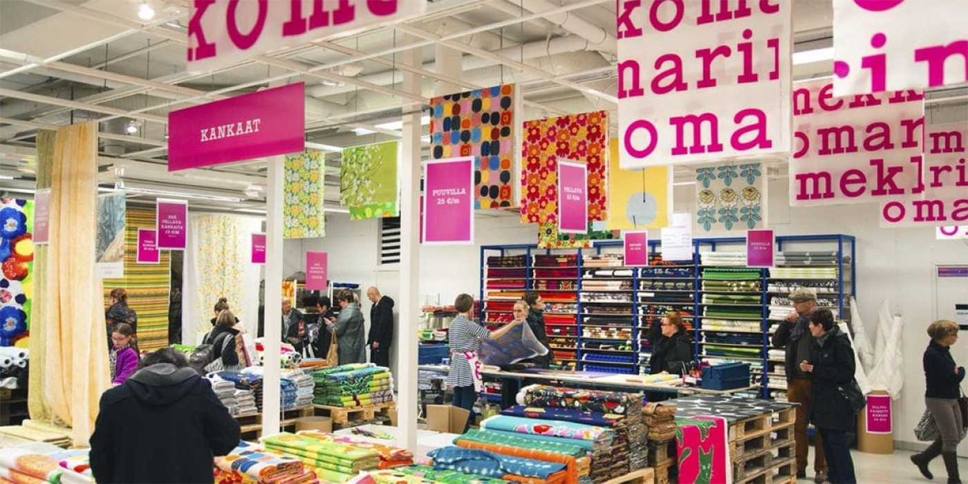
If there’s one thing Marimekko is known for, it’s those big, bold prints that we love. As much as we adore them, knowing how to work with such powerful patterns in our home décor can be a little intimidating. To prevent a space from looking too plain or, on the opposite end, overwhelming, here are some guidelines to keep in mind.

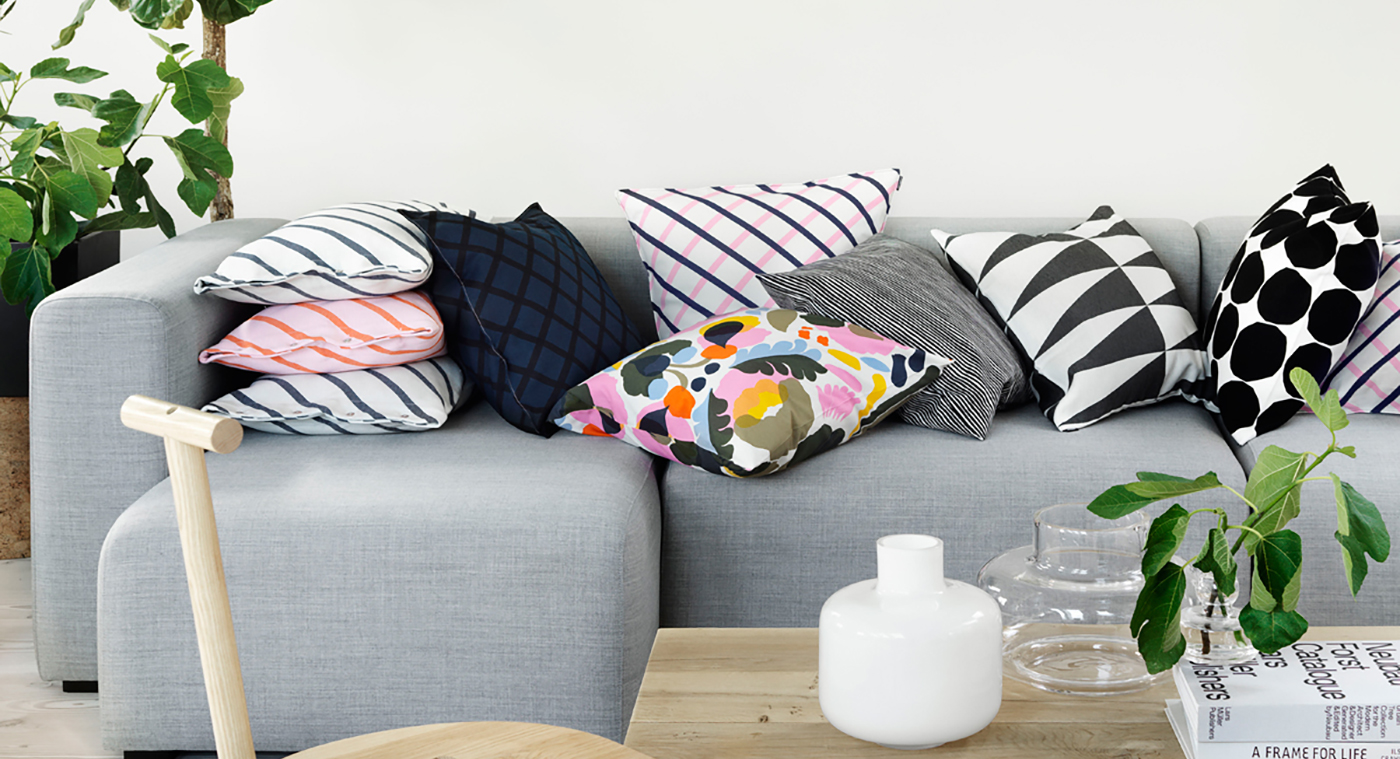
1. “Rule of three”-Things look better to the human eye in odd numbers, particularly three. Group items of three together and choose three prints you love in three different sizes, making the biggest and boldest one the focus.

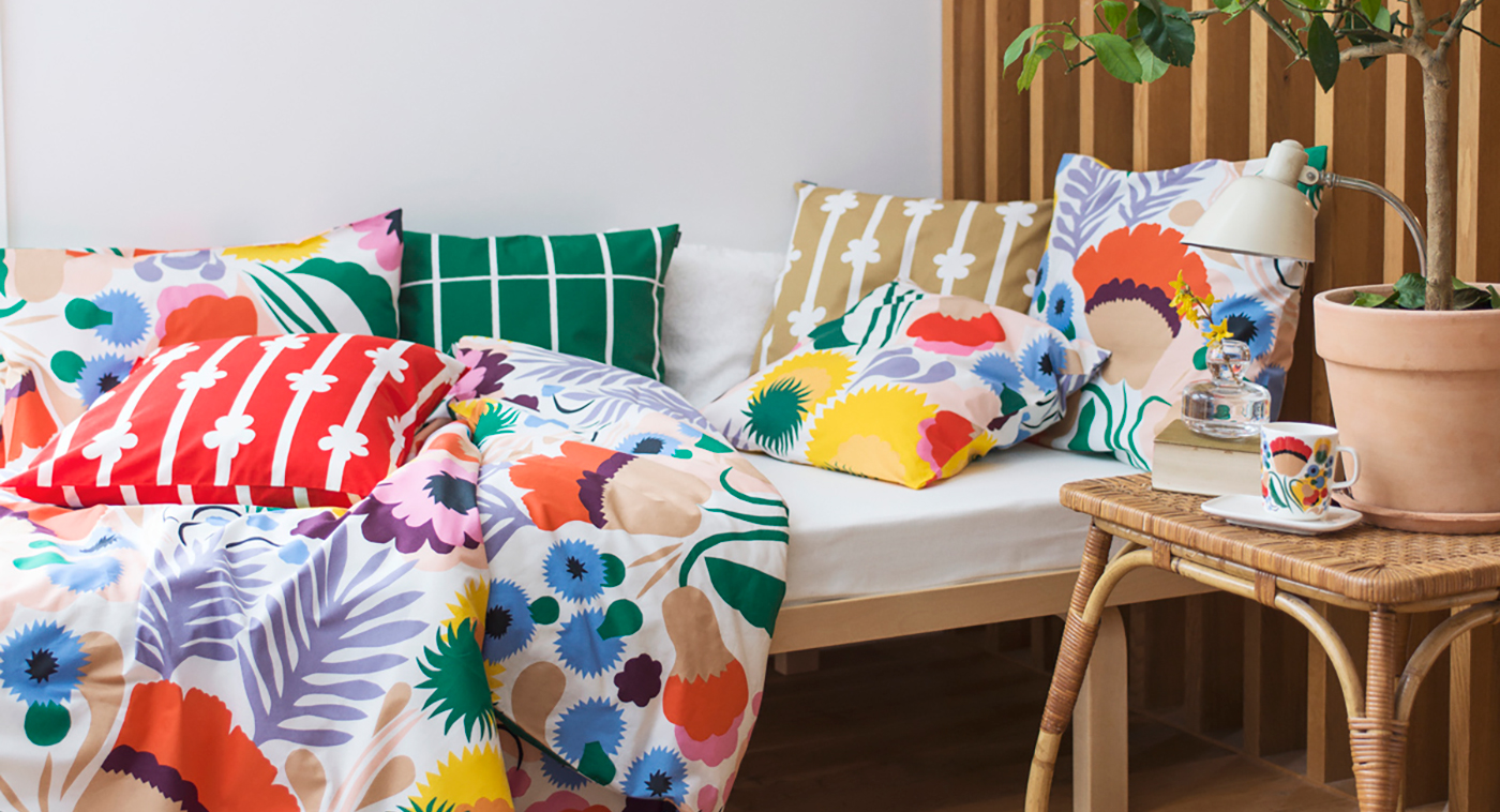
2. Variation in scale- Mix larger prints with smaller ones of similar color schemes. The smaller and busier the print, the more it will try to pull our gaze in. A larger print gives our eye a break and balances it out. 

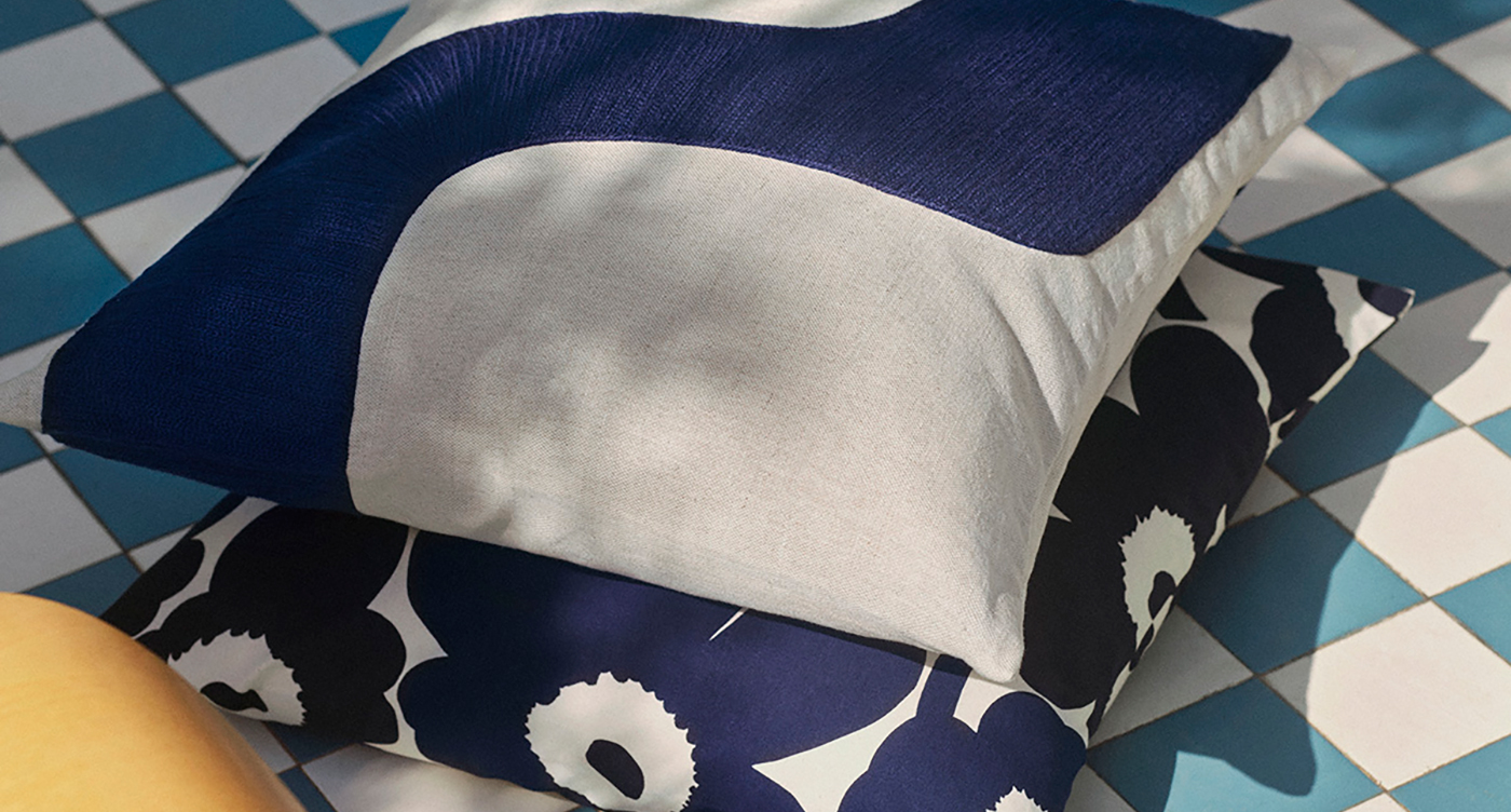
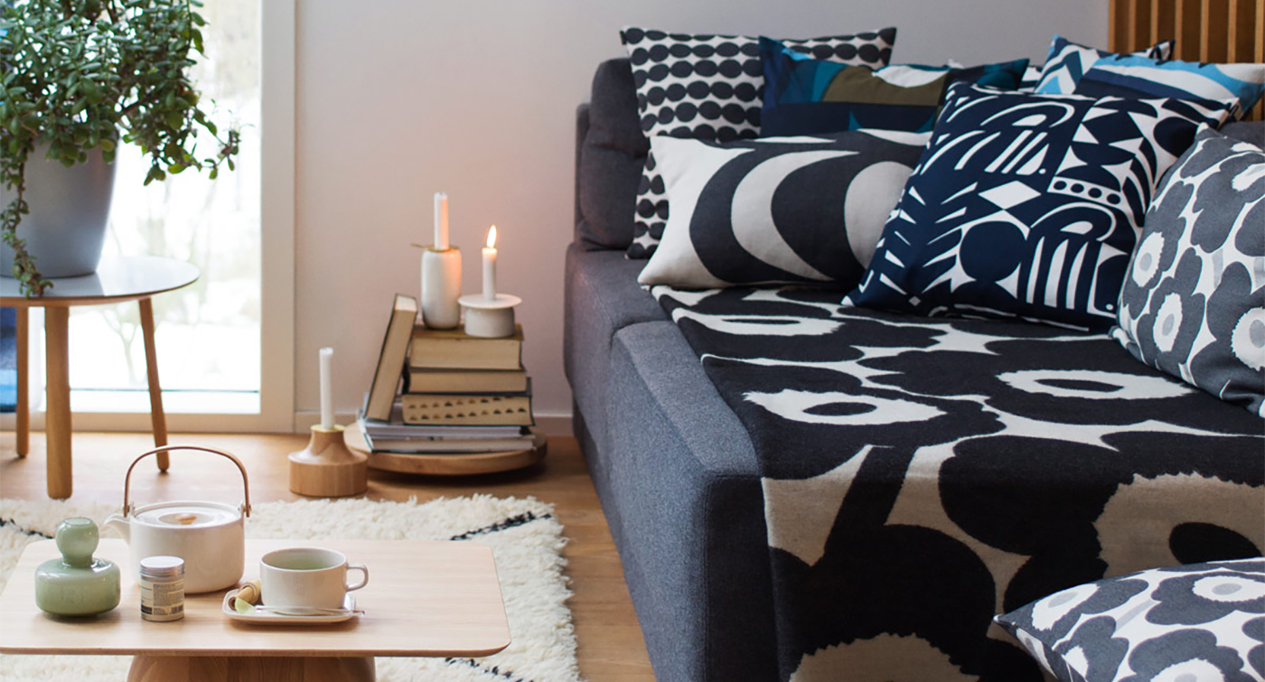
3. Stick with the same color intensity- If you like bright, neon colors, go for it! But don’t try to balance them with pastel hues to tone it down – they will only clash. Instead, use contrasting colors that are opposites on the color wheel. The only exception to this rule is if they are variations of the same shade, like light and dark greys.

4. Bold, black and white- These patterns can go with just about any color combination. Similarly, polka dots and stripes can act as a solid since they are such a basic pattern, and pair well with floral prints.

5. We had to end on an odd number, didn’t we? Just making sure you’re still paying attention. Overall, don’t be afraid of color and try not to be too “matchy matchy.” Patterns are an opportunity to give your space some personality, so be playful and fearless.

If you have made magic in your home by mixing patterns, or have encountered a decorating disaster, we’d love to hear about it. Just leave a comment below with your story and/or pictures.

Aalto vase
Previous Post
January 17, 2020
Aalto Vase
Next Post
January 18, 2020
Inside Marimekko Headquarters (Part 1 of 5)
Marimekko store
FinnStylecom

Chad

160 Posts0 Comments

You May Also Like

DIY Marimekko Doggy Bandanas

DIY Marimekko Doggy Bandanas

Aug 29, 2024
Marimekko No-Sew Coaster

How to Make No-Sew Marimekko Fabric Coasters

Jul 22, 2024
Marimekko x Samsung Collaboration

Marimekko x Samsung Collaboration

May 23, 2024
Copyright All Rights Reserved | Theme: BlockWP by Candid Themes.